Through the course of my Honors Project, I have learned a lot about applying statistics to the real world. Following Mr. Pethan on his project/experiment was a very valuable learning experience. This project gave me a deeper understanding of not only the curriculum we learn in the classroom but how it is applicable to many scenarios. The entire experiment as a whole was put in place to see which 5th grade class was learning stronger learning skills in the classroom. There were two types of classrooms that we assessed, the first being a standard classroom which taught curriculum and the second being a classroom that used project based curriculum to teach their students. The assessments that I graded had to deal with the creative portion of learning. Students were presented the task of creatively distributing a new invention to various groups of people. The assessment was so difficult because it was asking 5th grade students to be incredibly expansive on as the questions got narrower in content. Although there was some bias in our experiment the data was still very useful. The data helped us show that there was no significant difference between each classroom. There was also no significant difference if the student that we were testing was a male or a female. Also, when we plugged the numbers into StatKey we found that our regression line on a few graphs did not show substantial correlation or causation between the student`s MCA Score and their creative thinking. The data that we found did not follow the normal bell curve shape and it showed us that across the board creativity is not something that is strongly applied to the curriculum. The creativity that students exhibit may just come from their raw, individual creative thinking. Regardless of the data, I think it is important that we continue to apply creative thinking into the curriculum of young students. If we continued to apply creative thinking into the curriculum I do believe you would see some difference between the students who have creative thinking and the students who do not. The end of the year examines will be very interesting. For further examinations I think it would be interesting to combine the creative portion of thinking with the critical thinking aspect that so many students have well developed. There are also many other directions that we can take to evaluate thinking both critically and creatively. The assessment was very useful because it showed me how the statistics and lessons that I learned in the classroom could be applied to find out actual statistics and solve problems outside the classroom. I learned that collecting data talks a lot more time then actually sitting down and analyzing the data. Although the data did not turn out how we initially thought the data has lots of valuable content. It shows us improvements that we can make in research and collecting data and differences in the curriculum that we teach students.
Friday, February 13, 2015

Friday, January 30, 2015
Rebecca Houston -- Minute to Win It
Over the course of the Fall Statistics Class my favorite project would have to be the Minute to Win It Experiment. Doing this experiment was fun because we got to decide what experiment we wanted to do and we got to test people ourselves. I also learned the most during the course of the Minute to Win It Experiment all because of the paper that we had to write after we did all of the experiments.
Writing the paper taught me how to correctly use p-value, difference in means, null and alternative hypothesis, and it helped me realize the power of numbers in statistics. I learned what numbers were valuable and I learned what values were statistically insignificant. This project also taught me a lot of inconsistencies and errors. Before this project I always believed that you could have an experiment happen with very few errors. This is a fantasy, I learned just how difficult it was to have a "perfect" experiment. It is incredibly difficult, even though this experiment was only contestants moving a cookie from their forehead to their mouth, the data that we retrieved and the errors that we noticed were incredibly complex for such a simple experiment.
I enjoyed this experiment because it was the most fun and I learned the most. This project was the most applicable project that we did all semester because we applied what we were learning to a project that we completely in charge of. This project was the highlight of my statistics class.


Friday, January 23, 2015
Ultimate Frisbee
Throughout my Stats Experience I felt that there were many awesome projects that we did. But the one that I felt was the best was the Ultimate Frisbee Unit. Not only did I enjoy the playing of Ultimate Frisbee but I also liked the drafting of the players. I learned about how to use z-score to our advantage and what attributes to use. I also learned what attributes I should not pick. I enjoyed playing with my team, even though we only won one game. The reason we did Ultimate Frisbee was to show the relationship between good statistics and statistics that were not needed. We used a spread sheet to find the attributes that we wanted, then we found a Z-score to find the power ranking. We decided to use touchdowns, Short completions, and Long completions. We did not use the defensive side of the spread sheet, which probably led to our downfall in the draft. What I learned from this project is that I now know how to use the data to find what you are looking for in a person. You can apply this to hiring people to work for a company, which is somewhat similar to drafting a player. You could use this to try to find the best person for the job or game. It uses statistical data to select the best overall player, instead of going by a gut feeling.


Fav Stats Project
When I first signed up for statistics, I was not expecting so many projects. There was a lot of homework and videos to watch but there was almost a project for every section. This really made it a lot easier to learn the material needed for the quizzes and tests.
My favorite project throughout the entire course of statistics was our GapMinder project. My partner, Mara, and I compared the murders (per 100,000 people) and children per women (total fertility). The countries we mainly focused the results on were Guatemala, China, Sri Lanka because they were the ones who showed the most movement when we were observing our graphs.
We later learned that these two factors were, for the most part, related to each other because it seemed the higher the population, the higher the murder rates; not counting all the other events happening within the countries contributing to the results.
This is my favorite project because it allowed us to use what we have learned so far in stats, and apply it to our presentations. This helped me better understand this unit far more successfully than any other project we had.
Gapminder Project: Mikayla Winkels

Why is that? Well back in the day, most women stayed home and let the men of their lives to provide for their families. However, women starting fighting for their rights in the early 1900s, proclaiming that they could claim their own independence without a man. Meaning, that now a days, its normal for a woman to go to college so she can obtain a degree in the career field of her choice. The trend that we observed is that the longer women are in school, the fewer children she will have. This trend only really relates to high income countries, such as the United States, England, Canada, Japan, etc. We notice on our Gapminder that low income countries tend to still have more children. These countries come from South America, but mostly Africa.
Some countries we noticed, China and Yemen, our somewhat outliers, compared to the rest of the countries. Yemen in the 1970s increases, due to their traditional values. Having a male infant is very important in this country, since the family name is carried on through the male. China steadily decreases, increases, and then dramatically decreases. This is due to the One-Child Policy that the China government in forced, since they were overpopulating. This factor is probably not the entire reason why women are producing less children in the late 1950s and early 2000s, but education should be considered as a big factor. Besides these two countries, everyone else follows the general pattern. Over the past four decades, more woman are gaining more education during their reproductive ages, which does have an impact how many children they have.
Overall, this class was somewhat enjoyable. If it weren't for the projects, honestly I wouldn't have learned and understood most of the concepts. I would suggest keeping all the projects we completed this semester, and thanks for a great semester!
Ultimate Frisbee -- Michelle Denney

My favorite part of this stats semester was drafting an ultimate Frisbee dream team. I really felt like I understood this project and retained a lot of the information I learned. For this project, my partner and I found the qualities of a player we considered important and ranked our players based on these qualities.
One of these qualities was the percentage of short catches attempted and short catches made. This is one of the dark purple sections on the chart above. We considered this an important quality because a player with a high completion percentage has more potential than a player who can just run fast. We calculated out the z-score of this percentage to later use in a formula.
Another quality we found important was the percentage of long catches attempted and long catches made. This percentage is the middle dark purple column on the chart above. We found the z-score of these percentages and later put it into a formula that we used to find the overall top player of ultimate Frisbee.
The last quality we found important was the percentage of how many short catches were made when the player was defending compared to how many were attempted. We chose short catch defense instead of long catch defense because we decided it was more difficult to defend a short pass than a longer pass. This percentage is the dark purple column that is farthest to the right.
Watching Moneyball made this project easier because it made me realize that in order to be successful, you must pick the most important qualities of players and disregard other unimportant qualities. You must figure out why certain characteristics are important in order to have a good team. Moneyball was a great example of this. Playing Ultimate Frisbee made me realize short catches, long catches, and defense are all important to being an all around successful player.
Ultimate
One project that I really enjoyed was the Ultimate Frisbee draft. It felt like an MLB draft because every team had a different strategy for choosing the players that they did. My team chose to draft based on touchdowns and total completions per player. We didn't do very well in the simulated season, in fact we got second to last place. After the fact we realized that we should have drafted based on some other statistics like a defensive stat or completion percentage instead of number of completions. The whole idea behind the draft was to pick players that would win your games and ultimately win the championship. You couldn't draft players based on just one statistic because if you did then your team would only be good in that one stat. Your players had to be the best all around players and mix with the others to make the ultimate team. Below is a picture of our data and power rankings.


Moneyball
I felt like I learned the most from our Moneyball project. I also thought it was the most interesting project that we did in this class. I really enjoyed the whole project. I thought that using multiple regression data to analyze our players and choose the best ones was really interesting. I also liked using formulas in Microsoft Excel in order to analyze and rank our players. It was really cool how we could analyze thousands of data points so quickly using Excel.
I really liked the second quarter of stats a lot more than the first. I felt like I learned a lot more from the projects that we did instead of just learning with problems like in the first quarter. I wish we could have either spread the projects out between both quarters or found a way to incorporate more projects in the first quarter.
 I thought the Moneyball project was the most interesting because I felt like it was the one that really showed me a real world application for stats. During Moneyball I felt like I could honestly see myself doing something with statistics in the future, and that really excited me. I really enjoyed the Moneyball project.
I really liked the second quarter of stats a lot more than the first. I felt like I learned a lot more from the projects that we did instead of just learning with problems like in the first quarter. I wish we could have either spread the projects out between both quarters or found a way to incorporate more projects in the first quarter.
 I thought the Moneyball project was the most interesting because I felt like it was the one that really showed me a real world application for stats. During Moneyball I felt like I could honestly see myself doing something with statistics in the future, and that really excited me. I really enjoyed the Moneyball project.
Ultimate Frisbee Project - Alec Helget
The project that I enjoyed the most in this class was the Ultimate Frisbee project. I enjoyed applying our knowledge of z-scores and numbers to something that I could actually visualize. Having played ultimate in the past I had some idea of what skills are important in the game to maximize your wins. This project interested me greatly because I enjoy the game of ultimate and it was a nice change to projects with numbers that you can't connect to.
 |
| Power Ranking Top 10 |
During this project I learned how to apply numbers and percentages to make a z-score. I also learned how to make histograms that allowed you to accurately choose which players were the most valuable. Once we found the percentages of short throw completions, long throw completions, and short defense percentage we combined these numbers into a single z-score. This allowed us to rank all the players in a power ranking system to determine which players were the best. Once we reached the draft it was very easy to pick our players because we just went down the line. Our team, drafted by Colin, Shane, and myself ended up winning the class tournament so I think the method we used worked extremely well.
Jake Leif's Stats Final Quarter

During this last quarter of stats, I really learned a lot. Were these all things that I could write down on paper or recite from memory? No, but it was pretty much all hands on learning. Whether it was the experimental games or the Moneyball Ultimate Frisbee project, I felt that I took different pieces of knowledge from each project. But, out of these two, I found the Moneyball Ultimate Frisbee project to be the most helpful.
I felt that this project made a bigger impact for me because I felt like I understood it more. Not only did Mike and I do a good job in strategically picking our team, but we both took the time to understand what we truly wanted in an ultimate frisbee team. The equation, created by Mike, really grasped the understanding of how to choose a team based off of both offense and defense. We were then able to apply this equation to the long list of players that we were given. Even though we didn't win, I felt like I learned a lot through this process. The part that made this project stand out to me, more than the others, was the fact that I now feel that I can use this information in the future. Excel is a program that could be used for many things, and even having a basic understanding of the functions that you can use is a big help.
Now don't misunderstand me, the experimental games were also fun, but also a lot more stressful. I also don't feel that I learned nearly as much during that project because we were so rushed on time. The Moneyball Ultimate Frisbee project seemed more laid back and easily understandable. I don't feel that I could go out and use my knowledge gained during the experimental games as much as I could with the knowledge I gained during the Moneyball Ultimate Frisbee project.
This final quarter of stats, obviously more project based than the first quarter, I felt was more fun than the first. This being said, I felt that the first quarter provided more statistical knowledge and the second half seemed sloppy and rushed. I personally think that the first and second quarter should be mixed together so that the projects are intertwined with the lessons.
Ultimate Frisbee Draft -- Colin
My favorite project in stats class was definitely drafting ultimate frisbee teams. We got to do a lot of preparation for the final/ big part of the project. First we actually played ultimate frisbee and were told to keep track of stats that we thought were important to having a good team. Then Mr. Pethan had us watch Money Ball. Money Ball is about how statistics started to have a role in baseball. Baseball scouts before used their gut feeling to draft guys, now teams use all kinds of crazy statistics to get the best players.
After we got a better understanding on statistics in sports we had to get into groups with our classmates and figure out a draft process for an up coming ultimate frisbee league. My group mates were Shane and Alec. All of us were football players which helped us immensely because football is like ultimate frisbee in the grand scheme of things. All of us watch football a lot; we had the understanding that defense wins championships, just like the Seattle Seahawks. So our number one priority was getting a good defense. We broke down pass breakup percentage for long and short throws. After we go our top defenders we picked up the best short catch receivers. This is similar to the “ground and pound” offense in football, which is breaking down the defense with short plays that are very safe plays. We drafted going from the top down on our own specific power rankings. Obviously we were right on our draft selection because we won the championship.
I learned a lot about how important statisticians are to sports. Their methods save money for whatever organization they are working for. I also learned how important it is to have the same ideal player for the kind of team you want. Team work and communication are very important. This was such a fun and eye opening project. It was good to work with a team and get different views on things. Sadly, I was gone for a day, so I missed the nuts and bolts of the project which is when you get the graphs from the Excel documents in order. I wish I could of had a chance to see how Shane did all of that. Overall this was a fun, social, competitive, physical, and learning project.

Minute to Win it: Tilt a Cup
My favorite project was the Minute to Win it game. I liked it because it gave us the
freedom to completely choose our own project and rules. This meant that every group was doing a
different game, but still collecting similar data. Our game was called Tilt-a-Cup, which is a game
where both the player and the data collector are involved. After we collected data from fifteen different subjects, we ran it through a bootstrap hypothesis test on StatKey. From this we found our p-values and confidence intervals. In the end I think that this was a very educational project. I learned a lot from it and it was a fun experiment to conduct.

Thursday, January 22, 2015
Minute to Win it Game

 The game of Noodles is played by using thick spaghetti noodles to pick up rings . The noodles must be held by the individual’s mouth, and they could not use any other body part or prop besides that noodle to lift each ring. The rings then had to be placed in a “bucket”.Each person played two games: one with a full length noodle, and one game with only half of a noodle. Our group hypothesized that individuals would do better with the half length noodle because it would offer them more control. Using randomization we performed this experiment and used statkey to calculate the data, and concluded that our null hypothesis was correct.
Overall this project was really hands on and enjoyable and I think we all had fun doing it.
Food Preferences of Downtown Rochester
For our Food Preferences of Downtown Rochester project, Lia, Andrew, and I used a systematic survey and asked every fourth person that walked by the Peace Plaza downtown. Overall, we ended with twenty-nine responses. Not every person we asked agreed to take our survey, but those who did agree to take it answered a variety of different questions about food (see graphs for examples).
After we surveyed them, we decided which questions we thought were the most interesting. Then, we split the results between men and women and made images that portrayed their choices. It was interesting to see the answers people gave, and I was curious to see if knowing a person's gender would help you guess which answer they chose.
We did not have a large enough sample size to prove that knowing a person's gender would help you guess which answer they chose, but it is still a possibility that gender would make a difference. So, if I were to do this project again, or continue it in the future, my first priority would be getting a larger sample size.
I liked this project, because I am a hands-on learner. Instead of using random data, we actually got to collect the data this time, which I thought was very beneficial to see how the process worked up close. After we collected our data, I enjoyed making the graphs on Piktochart, because it was a new website and I got an insight on how to make your data easy to read and captivating.


End of Term Post
My favorite project of the term was our Ultimate Frisbee draft. I did spent most of my time on this project and really enjoyed it. I thought that it was cool to see how some of the stuff we learned actually applied to the real world. Adding in the sports aspect also made this project particularly interesting to me. I found it very cool that people in professional sports actually spent money to hire statisticians to find the best players.

For this project I worked with Colin and Alec. We started by breaking down all of the percentages for each player. These included short catch completion, long catch completion and short defense percentage. After that we found z-scores for those three categories. by combining all of those z-scores we were able to come up a with an overall power ranking. To check for consistency in our top players we created histograms. The histograms showed us that some of our top players were really only good in one skill. We used this information to draft a team that we felt comfortable with and in the end we won our class tournament.

Power Rankings:


In this project we kind of combined several things that we learned in the class. We learned how to utilize data and put it into z-scores. We also learned how to place that data into charts to help support our reasoning. Finally I learned a lot more about Excel than I knew previously.
Zoo Statistics
Throughout the course, I enjoyed the Infographic project the most. This project displayed the results of many questions we asked people at the zoo. We created a survey of 10 zoo related questions and went to the zoo to get results.
One reason I liked this project was because I felt it was a good introduction to everything we would be doing later on in the class. We had to create the survey, get the data, and then analyze it. Looking back on the project, I definitely feel like it was a good one to start the year off with. It helped us learn how to use StatKey and understand the concepts of it. I felt like this project was good because it helped us take key concepts of statistics and apply them to real life. One thing this project helped us learn how to gather data correctly. For our survey, we used systematic sampling. We gave the survey to about every fifth person that we saw at the zoo. To look at our data results, statkey helped us visualize the results. I feel the infographic itself was a good representation of our data. We chose 5 questions to display that we felt were a good representation of our data. We had to keep it minimal. We strategically used colors and pictures instead of labels to help keep our graphs less crowded.
My favorite part of this project was probably making the infographic itself.

One reason I liked this project was because I felt it was a good introduction to everything we would be doing later on in the class. We had to create the survey, get the data, and then analyze it. Looking back on the project, I definitely feel like it was a good one to start the year off with. It helped us learn how to use StatKey and understand the concepts of it. I felt like this project was good because it helped us take key concepts of statistics and apply them to real life. One thing this project helped us learn how to gather data correctly. For our survey, we used systematic sampling. We gave the survey to about every fifth person that we saw at the zoo. To look at our data results, statkey helped us visualize the results. I feel the infographic itself was a good representation of our data. We chose 5 questions to display that we felt were a good representation of our data. We had to keep it minimal. We strategically used colors and pictures instead of labels to help keep our graphs less crowded.
My favorite part of this project was probably making the infographic itself.

Statistics Project Review
Out of all of the projects that we have done for Statistics the most enjoyable in my opinion was the Minute to Win It project. Not only did it help me understand the difference between two different types of experiments but it also introduced me to a different way of writing a paper. My partner and I took the game "Nutstacker" from the TV show Minute to Win It and changed it so participants stacked either small nuts or big nuts. We gave the players points based on how many nuts they could stack and take them back down in a minute and compared the results. We also conducted an observational study by comparing how many points guys and girls earned and looked to see if girls got more points than guys.

In the end, the results from our experiment helped us to concluded that it is plausible that the reason that players gained more points was because of bigger size of the nuts that they stacked. After conducting our experiment we had to write a technical paper which was different from the usual kind of paper that we have to write for other classes. While writing the paper I had to make sure that we stated nothing but the facts from our experiment and to make sure that it wasn't filled with fluff. I believe that writing this paper will help me out later when I'm in college and I have to write an essay for a math class. In the end this project was very helpful to me in understanding experiments and observational studies.

In the end, the results from our experiment helped us to concluded that it is plausible that the reason that players gained more points was because of bigger size of the nuts that they stacked. After conducting our experiment we had to write a technical paper which was different from the usual kind of paper that we have to write for other classes. While writing the paper I had to make sure that we stated nothing but the facts from our experiment and to make sure that it wasn't filled with fluff. I believe that writing this paper will help me out later when I'm in college and I have to write an essay for a math class. In the end this project was very helpful to me in understanding experiments and observational studies.
Cory Wentland's Stats Blog
Coffee + Donuts = Statistics
I was not sure what to expect when I signed up for statistics, but I am pleased with my decision to take this class. We did a lot of projects that helped me learn more about statistics, and how to apply it in the world. My favorite project I did was make a display of graphs and information my group collected on the choice of coffee and food items of customers at Dunkin' Donuts. I liked being able to use one of our hybrid days to go to Dunkin' Donuts with my group members, Erika and Christina, to collect data. We were at Dunkin' Donuts from 9:45-10:30 a.m. collecting data from 30 customers, with the consent of the manager.
This was our survey:


After we collected data from each individual survey, we plugged them into a Google Docs Spreadsheet. The spreadsheet allowed us to observe trends and possible correlations. The spreadsheet also displayed different graphs that we could use as references when making more personalized graphs for our final assignment. All of the data that we used was based off of a 95% confidence interval. When we started this assignment, confidence intervals were still very new to us. This project made confidence intervals much more clear to me, and my team's data and work proved to be a good reference to look back to whenever I became stumped on how to use other information in this course.
My favorite part of this assignment was designing the page. I learned a lot about computer design and how to make things visually appealing. Our group decided to make the design of our page look like a Dunkin' Donuts coffee and donuts shop; complete with customers, a menu, and other realistic details.
This is our final project:

My favorite part of this assignment was designing the page. I learned a lot about computer design and how to make things visually appealing. Our group decided to make the design of our page look like a Dunkin' Donuts coffee and donuts shop; complete with customers, a menu, and other realistic details.
This is our final project:

Overall, I am very happy with this project, even though it took us a long time to complete. This project did not only help me with statistics, but it also allowed me to get comfortable with talking to strangers, acting professional, getting things done in a timely manner, and it got me a free dark roast coffee. I also became very passionate with the webpage design. I am a perfectionist, so details were my main hindrance when it came to getting this project done on time. I would do this project again, if given the chance; for it was not only enjoyable, but it also increased my knowledge and understanding tremendously. This class has been very beneficial to me, and projects like this one are what helped me learn and grow.
Zoo Stats
My favorite project that I worked on over this past semester in Mr. Pethan's class was our Infographic project. I enjoyed getting to work with real world people and getting to know their opinions. For this, my group asked questions relating to going to the zoo. We went to Oxbow Park and asked every 5th person who entered the park to take our survey. We did this until we had about 30 surveys completed.
After we took time to look over our surveys, enter our data, and create graphs, we chose five of our ten questions to use in our infographic. With this data, we created graphs so they would fit our theme of the zoo. This was my favorite part because it was a chance to be creative. I enjoyed creating the graphs on Piktochart and then adding different details in Excel.
On this infographic, you can see the different questions we asked people and their responses. You can also see our margin of error for every question, and how they differentiate from each other. Some of our questions were fairly equal for their results, where others were significantly different. The most significantly different results we found were for our subjects favorite type of animal at the zoo. The majority of our subjects said they preferred mammals over any other type. This surprised me because I thought there would be more variation with how many people we surveyed.
I enjoyed working on this project and everything it included. If I was to do it again, I would like to try and survey people at the Minnesota Zoo, especially since there are more animals at that zoo and a different array of people. I would also hopefully be able to get more than 30 people to take the survey, and get more information and a smaller margin of error.

After we took time to look over our surveys, enter our data, and create graphs, we chose five of our ten questions to use in our infographic. With this data, we created graphs so they would fit our theme of the zoo. This was my favorite part because it was a chance to be creative. I enjoyed creating the graphs on Piktochart and then adding different details in Excel.
On this infographic, you can see the different questions we asked people and their responses. You can also see our margin of error for every question, and how they differentiate from each other. Some of our questions were fairly equal for their results, where others were significantly different. The most significantly different results we found were for our subjects favorite type of animal at the zoo. The majority of our subjects said they preferred mammals over any other type. This surprised me because I thought there would be more variation with how many people we surveyed.
I enjoyed working on this project and everything it included. If I was to do it again, I would like to try and survey people at the Minnesota Zoo, especially since there are more animals at that zoo and a different array of people. I would also hopefully be able to get more than 30 people to take the survey, and get more information and a smaller margin of error.

Minute to Win it Project
Throughout the semester I thought that the Minute to Win it project was the most fun. My groups game was bouncing skittles into a cup. The objective to this game is to get as many skittles into a cup as possible by bouncing them. During this we had the contestants perform with both right and left hands. Later we found out that most players made more skittles in a cup with their non dominant hand than their dominant hand, which my group found it to be very odd. I also like the Minute to Win it project because we got to play other games that students in my class came up with. My favorite out of all of them would have to be trying to bounce a ping pong ball into a cup of water. I also liked the game where we got to see how far you could throw an airplane. Even though I am not good at throwing airplanes, I still really enjoyed it. Overall I really thought that the Minute to Win it project was the best and most fun project throughout this semester.


Minute to Win it: Catch the Pencils

My group's project, or game, was called catch the pencils. The object of the game was to catch as many pencils in the palm of your hand after balancing the pencils on the top of your hand. Not only did I enjoy the game but I also enjoyed the project because we had a chance to participate in other groups projects by playing in their game. each game was unique and had their own challenges. Out of all the other game we participated in I believe that the paper air plane throwing was the most fun. There is something fun about throwing paper air planes that is addicting. I think the most challenging game to play and complete was the bottle shaking game. The object of the game was to shake all of the jelly beans from one bottle into the other. That doesn't sound like a hard task but it is a lot harder than it sounds.

My group's project, or game, was called catch the pencils. The object of the game was to catch as many pencils in the palm of your hand after balancing the pencils on the top of your hand. Not only did I enjoy the game but I also enjoyed the project because we had a chance to participate in other groups projects by playing in their game. each game was unique and had their own challenges. Out of all the other game we participated in I believe that the paper air plane throwing was the most fun. There is something fun about throwing paper air planes that is addicting. I think the most challenging game to play and complete was the bottle shaking game. The object of the game was to shake all of the jelly beans from one bottle into the other. That doesn't sound like a hard task but it is a lot harder than it sounds.
What do BHS Seniors eat??
In the first few weeks of stats we started a project on Infographics. We did ours on what Byron High School Seniors eat. Some things that were useful to me for the rest of the semester was knowing what stats could actually be used for, also different ways of showing your data with using the least amount of words possible, and how to be creative while doing that.
The biggest thing about stats is knowing what exactly it is used for. Before I thought it was really boring but now I realize all that you can do with stats. It may not be for me, but it is cool to know all you can do with it. In this project we used stats to find out what exactly BHS Seniors eat. Knowing this information we could have brought this to the lunch ladies for ideas on what to make so that more students would buy school lunch and actually enjoy it. The stats that we found could be used for so many things. We could have also found out what the other grades enjoyed by having them take the same survey and compared the results.
The next thing I learned was to try describing things in the least amount of words. With that you can use pictures or numbers to display what you are tying to say. This helps it become more appealing not only to the reader or the person analyzing the data but more fun to make as the designer. This brings in the creativity. Stats is really big on creativity -- you want your data to look appealing but also accurate.
In conclusion this project helped me learn a lot on different things you can bring into stats. Creativity and brains, these two things can get you far in the stats world. Throughout this quarter I have learned about different jobs involving stats and how stats can either be really fun or extremely awful. But through it all stats was a great class to take. This project was my absolute favorite because I liked collecting data and knowing exactly how to do it and the best ways too.

Infograph - Culvers
During the beginning of the first quarter, one of the first projects we did was an infograph on Culvers and what people like about the food and ice cream there. This project was very helpful to me because it showed me how to make an infograph and gather data. This project also showed me how statistics can be very helpful in finding out people's opinions towards things and what may matter to some people but not to others.
The infograph project was really interesting to do as well as learn how to make different graphs that showed how people responded to all of our survey questions. I never knew that there were certain types of survey questions like open-ended or a scale question and how some of these types of questions are better than other. I also learned what kind of questions can cause bias, which can mess up your data if you are not careful.
Creativity is another huge part of Statistics because if a graph is boring and plain it may not interest many people, but if a graph is pretty and colorful that is another story. As long as the stuff that makes your graph look more presentable does not distract people from the story you are trying to tell, then the creativity is a good thing for presentation.
A large part of statistics is gathering data -- without data it would be hard to prove if something may be wrong or right. This project helped me learn how to properly set up a survey and ask the proper questions to those individuals. I learned the right and wrong ways data can be collected, which helped me make sure my data was good, as well as which questions may not be the most helpful. Knowing when to ask people questions helps too -- you don't want to bug someone while they may be doing something because that may bias the answer they give for your survey.

In conclusion, this project taught me a lot about statistics, including gathering data and how creativity can help other people understand more about what you are trying to tell them or teach them. If I had to do this project again, I would probably ask more questions as well as ask more people to get a larger sample size. I also learned that doing statistics projects can be a lot of fun.
Dunkin's Demographics | Erika Miller

This quarter, we were faced with the challenge to actually put what we learned in class into real life context. For our objective, we aimed to find what drew people to Dunkin' Donuts.
Taking a sample size of thirty at an intermediate time frame, 9:45 to 10:30, we gave a survey of almost every single costumer that entered the coffee shop. With our stats, we discovered what exactly Dunkin' Donut costumers were looking for when they went through the doors. These statistics are things that Dunkin' could actually use, if they were deciding where to focus advertising or expenditures, per se.
When doing this project, I learned a great deal. The formulas and mathematics that we learned in class became more than just numbers on a sheet. By putting the survey results into context, we were able to apply the formulas and actually understand what we were figuring out when we used those formulas. Going out and gathering data was also a great experience that can be used all throughout life.
Wednesday, January 21, 2015
GapMinder Reflection
In the course of Statistics with Mr. Warneke, my favorite project was the GapMinder project from second quarter. It was my favorite project because we got to make our own video on how different categories in the bubble chart affect others. It was interesting to see which categories had the most affect and the least affect. It was also fun to try and find categories that 'caused' the other one to change. I did the project with Sydney Brooks and we compared the income per person and the mean in years in school. In our example they were both correlated and we were unsure of the causation but still had a pretty good idea. The income per person could cause the mean years in school to change, or the mean years in school could cause the income per person to change. It was interesting to me to see that the two variables were interchangeable.
GapMinder
For one project we were introduced to this website called GapMinder. It had all of these different categories from natural to unemployment. Each category showed the stats of hundreds of different countries.
I thought this project was really interesting just because you could compare the United States with all of these other countries on different topics you wouldn't even think of. You could see the life expectancy of where we live and compare it to other countries that are about 10-20 years less than ours. You could see if a certain category caused an increase or decrease in other categories. In our GapMinder project we compared income per person and mean years in school. I really like this project because they were both interchangeable with causation.

I thought this project was really interesting just because you could compare the United States with all of these other countries on different topics you wouldn't even think of. You could see the life expectancy of where we live and compare it to other countries that are about 10-20 years less than ours. You could see if a certain category caused an increase or decrease in other categories. In our GapMinder project we compared income per person and mean years in school. I really like this project because they were both interchangeable with causation.

Gapminder
During the process of the Gapminder project, I learned that female literacy rate and female employment rate relate to each other. There are also some other lurking variables. The lurking variables may depend on which countries you are looking at. From my classmates presentations, I learned how their choices were affected by different correlations, causations, and lurking variables. I also learned a little bit about a few countries and what may have caused that to have dramatic decreases or increases. We used the Internet to look up possible causes for dramatic decreases and increases. If I could change this, I would talk about the general trend and add in a conclusion.
Personal Hygiene Project- Emily Majewski

This project was our info-graphic assignment. This was a small group project that we completed during Statistics A in first quarter. For this project, we first had to come up with a survey. We had to think of questions that weren't bias, and that had appropriate answers to choose. For example, you couldn't have a question that asked which do you like better, apples or oranges. You had to include at least one other option that said something like "Neither" or "Other". It is important to do this so you don't get inaccurate answers from people, just because they were forced to choose one option. After we had our survey made (on Google forms) we had to do an SRS to figure out which people we were going to ask these questions. Our population of subjects was the Sophomore class at Byron High School. We obtained an alphabetical list of all the students in the class of 2017 at Byron. This list was also numbered. We went on to a random number generator website and chose the students whose number corresponded to what the generator found. All of the questions in our survey were related to personal hygiene. Because we did it on Google forums and handed people our iPad to complete it on, everything was anonymous. We had to approach them politely and ask them if they would please take a quick survey for us. This was the process of sampling that we did.
The question that I have displayed here was called "What toothpaste brand do you use?" We had three of the biggest brands in toothpaste, as well as two other options for people who didn't use one of these three brands. The two other options were "I don't know" or "Other". As you can see from this chart, the majority of people either use Colgate or Crest.
I liked doing this project because it was hands on and making the graphs and charts was fun.
Minute to Win It Project Reflection
This project helped me learn the difference between observational study and experiment because of what ours was and its characteristics. Our project was an experiment because there was randomness involved and we had control over our treatment groups. It would've been an observational study if we didn't have any control over our treatment groups.The challenges of running a real experiment and collecting data was difficult for a couple of reasons. We didn't know exactly what to expect but we avoided being bias as much as we could have. There was an outlier but thankfully it didn't make much of a difference when averaging out the completed data. The part of the project that was the most fun was watching the teams participate in our game. It was exciting to see how fast they could get it done and to see who would be the winner. This was definitely favorite project because we actually got to do games. It was fun going around and seeing all of the different challenges there were. Plus we got to eat the leftover skittles from the project so that was probable the best part.
Snatch the Pencils (Minute to Win it)
For our Minute to Win it project, my group made a game called Snatch the Pencils. The objective of the game is to catch a pencil with one hand only. After getting one pencil, you add one more and repeat the process until your one minute is up. We would have the player do two trials. One with their right hand, and one with their left. We did this to see if scores would be higher or lower when the person used their dominant or non-dominant hand. This was my favorite stats project because it was fun watching people try to do our game that was somewhat difficult. Some people got it right away while others struggled. I also liked this project because our group got to go around and play games that the other groups have set up.


Food Preferences Survey
Towards the very beginning of the class, way back when the weather was nice and we could survey people outside, I collaborated with two other stats students to conduct a statistical study on food preferences. By providing a real life experience of going out and collecting data, this project gave me the bedrock of real world knowledge of the challenges statisticians face and the many ways a study can go wrong before you even get to the point of having data to analyze.
As we started the project, we learned about the challenges one can run into in terms of choosing good questions that people will find relevant and which, as much as possible, can’t be tainted by lurking variables. If you have an excess amount of potential lurking variables in your question, your data could be almost impossible to make sense of even if you collect and analyze it well. So we went back and forth with different ideas for questions for some time.
In many ways, even the questions we had settled on and the setting for collection we had chosen to conduct the survey weren’t airtight, even after much deliberation. There were certainly flaws in the data, but I think we did pretty well overall, and it was an exhilarating experience to gather our own data. We also had fun making a graphic which you can see here: https://magic.piktochart.com/output/2851296-stats-project
Friday, January 16, 2015
What Do Byron Seniors Eat?
What do Byron Seniors Eat?
During the beginning of the first quarter, the first project we did was an info-graphic on what Byron High School seniors eat. This project was beneficial to me for the rest of the quarter for a few reasons: first it showed me how to be creative, second it showed me the value of statistics, and finally it showed me how to gather data.
Creativity is a huge part of statistics, sometimes statistics prove to be boring and this leads others to not want to look at your data. Therefore, they miss your message. The infographic project showed me how to arrange my data attractively in order to help other people get my message and understand the "story" of the data.
The second thing it taught me was the value of statistics. Statistics have a nasty stereotype as being boring, but doing this project taught me the value that they have not only to me, but to everybody in the professional world. If we were planning a class luncheon it would have been much easier for us to provide the food everyone would like compared to a blind guess. This is why large businesses use statistics in order to find out what the consumer likes as well as advertise what they have to offer.
A large part of statistics is gathering data. There are right and wrong ways to do this and this project showed me how to do it correctly. There are a few ways to gather data: we could have given them an open response if we wanted to find out exactly what they like, or we could give a few options in order to narrow it down to a smaller decision. There is also a right and a wrong way to gather data, disturbing people while it inconveniences them leads to bad data, because they will be irritated with you. In order to gather the best data you need to be polite and courteous.
In conclusion this project taught me a lot about statistics, including data gathering practices, the value of statistics, and the beauty of creativity. If I were to do this project again, I would give more options in order to find out exactly what people like to eat. This project was a well designed project, that is why I think it was the best one we did this term.

Thursday, June 5, 2014
After School Survey
This quarter I worked primarily on our BHS After School Activity Survey. We surveyed 50 students from grades 9-12 over 3 days. We asked the students a series of questions about how they spend their time after school. We were looking for how grade and gender affected the way students spent their time.
After the survey was complete we spent a day in class analyzing our results. We found a relationship in four graphs. The following differed by grade: amount of sleep, how students feel about their free time, how many hours per week students work, and how many hours per week students participate in an after school activities. We found major differences between seniors and other grades in two of our graphs. Seniors had a lot less sleep than other grades, and they spent less time participating in after school activities. Seniors who worked also spent more hours working than students in other grades. We chose to display our data through box plots, histograms, and bar graphs.
A major problem was that our graphs looked lumped together due to the fact that we had wide hour ranges on our multiple choice question options. The quality of this data could be improved by taking a larger sample size and asking more detailed questions. By doing this we would be able to better prove our theories correct or incorrect.
In this graph, it shows how seniors are sleeping much less than students in other grades. You can see here how students in grades 9-11 are very similar in amount of people in each sleep interval, while seniors have more students in the bottom two intervals. We think the reasoning for this could be that seniors are the oldest which means they work more, and have higher stress, leading to less sleep.

The first graph here is a graph of how senior are working a lot more hours than the other grades. The amount of people increases with each, in which seniors work the most hours. Freshmen work the least with the majority of the grade not working at all. The reasoning behind this is probably that since seniors are oldest they need to work more for college and other reasons. Freshmen aren't able to drive so that can be a factor.

In this graph, we compared grades in time spent participating in after school activities. As seen here, the seniors have a relatively low amount of students participating in after school activities. The Juniors have a good amount of students who did not do any after school activities. But the ones who did participate spent many hours doing it. Seniors had more people in after school activities, but they didn't spend as much time doing them. Freshmen and sophomores had equal amounts of people in after school activities and times spent doing them.

After the survey was complete we spent a day in class analyzing our results. We found a relationship in four graphs. The following differed by grade: amount of sleep, how students feel about their free time, how many hours per week students work, and how many hours per week students participate in an after school activities. We found major differences between seniors and other grades in two of our graphs. Seniors had a lot less sleep than other grades, and they spent less time participating in after school activities. Seniors who worked also spent more hours working than students in other grades. We chose to display our data through box plots, histograms, and bar graphs.
A major problem was that our graphs looked lumped together due to the fact that we had wide hour ranges on our multiple choice question options. The quality of this data could be improved by taking a larger sample size and asking more detailed questions. By doing this we would be able to better prove our theories correct or incorrect.
In this graph, it shows how seniors are sleeping much less than students in other grades. You can see here how students in grades 9-11 are very similar in amount of people in each sleep interval, while seniors have more students in the bottom two intervals. We think the reasoning for this could be that seniors are the oldest which means they work more, and have higher stress, leading to less sleep.

In this graph, we compared grades in time spent participating in after school activities. As seen here, the seniors have a relatively low amount of students participating in after school activities. The Juniors have a good amount of students who did not do any after school activities. But the ones who did participate spent many hours doing it. Seniors had more people in after school activities, but they didn't spend as much time doing them. Freshmen and sophomores had equal amounts of people in after school activities and times spent doing them.

Wednesday, June 4, 2014
After School Survey
Nathan and I decided to do a survey for each grade. This was a survey of how kids spent their time after school. A stratified random sample was done to select people from each grade. We asked them a series of questions about their time after school (mostly multiple choice). We were looking for any correlation between grades that we could represent through graphs.
After we had surveyed that was selected, we looked over the data for anything useful. We broke it down to four groups that had good correlation between grades. These groups were amount of sleep and free time and how much time people spent working or participating in after school activities. We found some differences between seniors and other grades in a couple of categories. Seniors had less sleep and time spent participating in after school activities and more time spent working. We displayed this data through box plots, histograms, and bar graphs.
The first graph here is a graph of how senior are working a lot more hours than the other grades. The amount of people increases with each, in which seniors work the most hours. Freshmen work the least with the majority of the grade not working at all. The reasoning behind this is probably that since seniors are oldest they need to work more for college and other reasons. Freshmen aren't able to drive so that can be a factor.
In this graph, we compared grades in time spent participating in after school activities. As seen here, the seniors have a relatively low amount of students participating in after school activities. The Juniors have a good amount of students who did not do any after school activities. But the ones who did participate spent many hours doing it. Seniors had more people in after school activities, but they didn't spend as much time doing them. Freshmen and sophomores had equal amounts of people in after school activities and times spent doing them.
This data could be more precise and accurate if we take a larger sample size. In a future study, we could ask more detailed questions that can prove our theories correct or incorrect.
Friday, May 30, 2014
Our Zombie Apocalypse
This quarter we did a pretty awesome Zombie Apocalypse Simulation. We started off the quarter knowing nothing about code. Here is our end result. The yellow smiley faces represent the humans, the green crooked faces are the zombies, and the twinkies are the food. The humans run away from the zombies, and the zombies run towards the humans. We also programmed a function to have humans the ability to reproduce. When two humans are on the same square there is a certain possibility that a new human will be created. The twinkies are used to feed the humans. If a human doesn't eat a twinkie within a time period they will starve and die!
We had the program include the option to change how many humans or zombies you want. You can decide how long it will take them to starve. Next, you can change the how big the grid is. Finally you can change how many food sources and the chance that food will move. We are pretty proud of this, because there are a lot of areas to customize.
All in all, we are pretty amazed at how our program turned out. We had a bit of a struggle getting to where we are today, but it was worth it. In the future we would add an interactive box for the reproduction rate, and to have an auto play button. We think it would be cool to have this as a live background on an iPod, or desktop. In the end, we had a good time in stats, and really learned a lot from Mr. Pethan.
We had the program include the option to change how many humans or zombies you want. You can decide how long it will take them to starve. Next, you can change the how big the grid is. Finally you can change how many food sources and the chance that food will move. We are pretty proud of this, because there are a lot of areas to customize.
All in all, we are pretty amazed at how our program turned out. We had a bit of a struggle getting to where we are today, but it was worth it. In the future we would add an interactive box for the reproduction rate, and to have an auto play button. We think it would be cool to have this as a live background on an iPod, or desktop. In the end, we had a good time in stats, and really learned a lot from Mr. Pethan.
Thursday, May 29, 2014
Zombie Apocalypse
For my group, our main project was a zombie apocalypse simulation. We built it throughout the entire quarter. This was the one I liked the most of our two projects (the other one was a survey, but I was more involved in creating this one). I liked it better than doing the survey because it was a lot more fun. Even though we really didn't know what we were doing at first, it began to make sense and we eventually only needed Mr. Pethan when there were glitches or bugs that we could not figure out, or just to make cool and complicated stuff. These are a few pictures of our final project.
The first picture is of the simulation as it appears when you are running it. The green dots are zombies, yellow dots are humans, and the yellow twinkies are food. Most of what we spent our time on was trying to get all these dots to interact with each other. Eventually, we made it so that humans would move randomly, unless there was food nearby, in which case they would move towards the food. They would always move towards food unless there was a zombie within their view, in which case they would move in the opposite direction of the zombie. Zombies just try to chase and eat humans.

This next picture is of the code. This is one small section, and it is the part where we programmed the human dots to evade the zombie dots. We did this by making the humans run through code that would analyze where zombies were around them. after that, they would pick which way was best to move based on where the zombies were, which is in the opposite direction.

This last picture is of another peice of code. This one is where we programmed what would happen if a human and a zombie landed on the same square, and how long zombies and humans would live without eating. To do this, we made it so that if a zombie and a human landed on the same square, the human would have a chance of turning into a zombie. To make them die off, we had to use the timestep and reset it everytime a human landed on a square with food. Zombies we just gave a certain time until they died off.

Most of the things in the game can all be changed very easily because we put buttons directly into the simulation when it was run, so you don't have to go back and forth between chrome and the code. You can just easily change many things like number of humans and zombies and how many food sources there are.
Cosmic Brownie Boogaloo

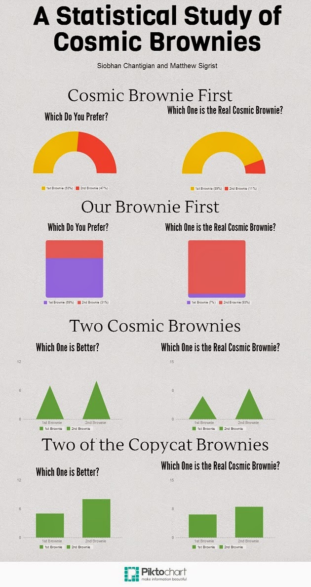
For our project, we asked as many seniors as we could to eat two brownies in a convenience sample that nevertheless managed to reach a significant fraction of the senior class. The experiment participants were able to volunteer to eat the brownies. Siobhan and I baked a batch of copycat Cosmic Brownies, and bought a box of manufactured brand name Cosmic Brownies. We assigned every volunteer to a random number, and this number determined in which order they would eat two brownies. There were 4 numbers, 1-4, with:
1 = Cosmic Brownie first, then one of our copycats.
2 = Our copycat first, then one Cosmic Brownie.
3 = Two Cosmic Brownies.
4 = Two copycat brownies.
After the subject had eaten both of the brownies, we asked them "which brownie, the first or second, that [they] prefer", as well as "which brownie [they] believe to be the store bought brownie," regardless of whether they had actually eaten a store bought brownie or not.
Due to the not-so-subtle difference in the bittersweet frosting on top of our scratch brownies, the difference between the two was recognizable, and this is reflected in the data.
.jpg)
A Statistical Study of Cosmic Brownies
.jpg)
We had this idea while we were looking at pinterest. There are many copycat recipes out there and we chose this because it was going to include cooking and I rather like brownies.
We chose seniors to be our population. We used volunteers and randomized the groups.
We had four different tests. We did the first two tests varying the order and the last two with identical brownies.
We originally predicted that people would like the cosmic brownies more than the copycat brownies. That was until we tried the difference. You can easily tell which one was store bought. I used to think that Cosmic Brownies were amazing until I did this project.
Clearly, as our graphs show, other people could also tell which brownies were store bought.
It was really interesting to see how their preference of brownie was impacted by which one they ate first.
Just note that due to our small sample size our data was not statistically significant.
By: Siobhan Chantigian
Pizza Survey!
My favorite project this quarter was the pizza survey I did with Molly and Alex. We bought two types of frozen pizza, one cheap, one expensive, both thin crust. We then had students eat one slice of each and record which pizza they thought was the most expensive.
Looking back, we introduced some bias by asking which one people thought was the most expensive. We should have just asked which one was better, thus not telling people there was actually a difference.
We also weren't able to keep track of all the students eating pizza, and some people got multiple pieces. Although this didn't really effect our data, it was still annoying.
After analyzing our data, we are 99% confident that 77% to 100% of students can determine which pizza is the most expensive. Going into this project, we weren't sure if we could really prove anything, but looking back, this confidence interval clearly proves that the expensive pizza we used was better than the cheaper pizza.
To make a general prediction about cheap and expensive pizza, we would need to test more types of pizza, in order to find if our data was a one time occurrence or a general rule for all frozen pizza.
 By Luke French
Looking back, we introduced some bias by asking which one people thought was the most expensive. We should have just asked which one was better, thus not telling people there was actually a difference.
We also weren't able to keep track of all the students eating pizza, and some people got multiple pieces. Although this didn't really effect our data, it was still annoying.
After analyzing our data, we are 99% confident that 77% to 100% of students can determine which pizza is the most expensive. Going into this project, we weren't sure if we could really prove anything, but looking back, this confidence interval clearly proves that the expensive pizza we used was better than the cheaper pizza.
To make a general prediction about cheap and expensive pizza, we would need to test more types of pizza, in order to find if our data was a one time occurrence or a general rule for all frozen pizza.

Class of 2014 College Map (:

Subscribe to:
Posts (Atom)