Thursday, June 5, 2014

After School Survey

This quarter I worked primarily on our BHS After School Activity Survey. We surveyed 50 students from grades 9-12 over 3 days. We asked the students a series of questions about how they spend their time after school. We were looking for how grade and gender affected the way students spent their time.

After the survey was complete we spent a day in class analyzing our results. We found a relationship in four graphs. The following differed by grade: amount of sleep, how students feel about their free time, how many hours per week students work, and how many hours per week students participate in an after school activities. We found major differences between seniors and other grades in two of our graphs. Seniors had a lot less sleep than other grades, and they spent less time participating in after school activities. Seniors who worked also spent more hours working than students in other grades. We chose to display our data through box plots, histograms, and bar graphs.

A major problem was that our graphs looked lumped together due to the fact that we had wide hour ranges on our multiple choice question options. The quality of this data could be improved by taking a larger sample size and asking more detailed questions. By doing this we would be able to better prove our theories correct or incorrect.

In this graph, it shows how seniors are sleeping much less than students in other grades. You can see here how students in grades 9-11 are very similar in amount of people in each sleep interval, while seniors have more students in the bottom two intervals. We think the reasoning for this could be that seniors are the oldest which means they work more, and have higher stress, leading to less sleep.


The first graph here is a graph of how senior are working a lot more hours than the other grades. The amount of people increases with each, in which seniors work the most hours. Freshmen work the least with the majority of the grade not working at all. The reasoning behind this is probably that since seniors are oldest they need to work more for college and other reasons. Freshmen aren't able to drive so that can be a factor.


In this graph, we compared grades in time spent participating in after school activities. As seen here, the seniors have a relatively low amount of students participating in after school activities. The Juniors have a good amount of students who did not do any after school activities. But the ones who did participate spent many hours doing it. Seniors had more people in after school activities, but they didn't spend as much time doing them. Freshmen and sophomores had equal amounts of people in after school activities and times spent doing them.

Wednesday, June 4, 2014

After School Survey

Nathan and I decided to do a survey for each grade.  This was a survey of how kids spent their time after school.  A stratified random sample was done to select people from each grade.  We asked them a series of questions about their time after school (mostly multiple choice).  We were looking for any correlation between grades that we could represent through graphs.  

After we had surveyed that was selected, we looked over the data for anything useful.  We broke it down to four groups that had good correlation between grades.  These groups were amount of sleep and free time and how much time people spent working or participating in after school activities.  We found some differences between seniors and other grades in a couple of categories.  Seniors had less sleep and time spent participating in after school activities and more time spent working.  We displayed this data through box plots, histograms, and bar graphs. 

The first graph here is a graph of how senior are working a lot more hours than the other grades.  The amount of people increases with each, in which seniors work the most hours.  Freshmen work the least with the majority of the grade not working at all.  The reasoning behind this is probably that since seniors are oldest they need to work more for college and other reasons.  Freshmen aren't able to drive so that can be a factor.

In this graph, we compared grades in time spent participating in after school activities.  As seen here, the seniors have a relatively low amount of students participating in after school activities.  The Juniors have a good amount of students who did not do any after school activities.  But the ones who did participate spent many hours doing it.  Seniors had more people in after school activities, but they didn't spend as much time doing them.  Freshmen and sophomores had equal amounts of people in after school activities and times spent doing them.  

This data could be more precise and accurate if we take a larger sample size.  In a future study, we could ask more detailed questions that can prove our theories correct or incorrect.

Friday, May 30, 2014

Our Zombie Apocalypse

This quarter we did a pretty awesome Zombie Apocalypse Simulation.  We started off the quarter knowing nothing about code.  Here is our end result.  The yellow smiley faces represent the humans, the green crooked faces are the zombies, and the twinkies are the food.  The humans run away from the zombies, and the zombies run towards the humans.  We also programmed a function to have humans the ability to reproduce.  When two humans are on the same square there is a certain possibility that a new human will be created.  The twinkies are used to feed the humans.  If a human doesn't eat a twinkie within a time period they will starve and die!

We had the program include the option to change how many humans or zombies you want.  You can decide how long it will take them to starve.  Next, you can change the how big the grid is.  Finally you can change how many food sources and the chance that food will move.  We are pretty proud of this, because there are a lot of areas to customize.

All in all, we are pretty amazed at how our program turned out.  We had a bit of a struggle getting to where we are today, but it was worth it.  In the future we would add an interactive box for the reproduction rate, and to have an auto play button.  We think it would be cool to have this as a live background on an iPod, or desktop. In the end, we had a good time in stats, and really learned a lot from Mr. Pethan.

Thursday, May 29, 2014

Zombie Apocalypse

For my group, our main project was a zombie apocalypse simulation. We built it throughout the entire quarter. This was the one I liked the most of our two projects (the other one was a survey, but I was more involved in creating this one). I liked it better than doing the survey because it was a lot more fun. Even though we really didn't know what we were doing at first, it began to make sense and we eventually only needed Mr. Pethan when there were glitches or bugs that we could not figure out, or just to make cool and complicated stuff. These are a few pictures of our final project.

The first picture is of the simulation as it appears when you are running it. The green dots are zombies, yellow dots are humans, and the yellow twinkies are food. Most of what we spent our time on was trying to get all these dots to interact with each other. Eventually, we made it so that humans would move randomly, unless there was food nearby, in which case they would move towards the food. They would always move towards food unless there was a zombie within their view, in which case they would move in the opposite direction of the zombie. Zombies just try to chase and eat humans.


This next picture is of the code. This is one small section, and it is the part where we programmed the human dots to evade the zombie dots. We did this by making the humans run through code that would analyze where zombies were around them. after that, they would pick which way was best to move based on where the zombies were, which is in the opposite direction.


This last picture is of another peice of code. This one is where we programmed what would happen if a human and a zombie landed on the same square, and how long zombies and humans would live without eating. To do this, we made it so that if a zombie and a human landed on the same square, the human would have a chance of turning into a zombie. To make them die off, we had to use the timestep and reset it everytime a human landed on a square with food. Zombies we just gave a certain time until they died off.


Most of the things in the game can all be changed very easily because we put buttons directly into the simulation when it was run, so you don't have to go back and forth between chrome and the code. You can just easily change many things like number of humans and zombies and how many food sources there are.

Cosmic Brownie Boogaloo


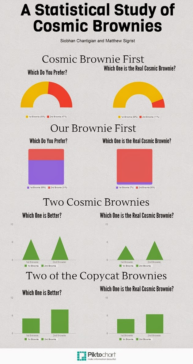
For our project, we asked as many seniors as we could to eat two brownies in a convenience sample that nevertheless managed to reach a significant fraction of the senior class. The experiment participants were able to volunteer to eat the brownies. Siobhan and I baked a batch of copycat Cosmic Brownies, and bought a box of manufactured brand name Cosmic Brownies. We assigned every volunteer to a random number, and this number determined in which order they would eat two brownies. There were 4 numbers, 1-4, with:

1 = Cosmic Brownie first, then one of our copycats.
2 = Our copycat first, then one Cosmic Brownie.
3 = Two Cosmic Brownies.
4 = Two copycat brownies.

After the subject had eaten both of the brownies, we asked them "which brownie, the first or second, that [they] prefer", as well as "which brownie [they] believe to be the store bought brownie," regardless of whether they had actually eaten a store bought brownie or not.

Due to the not-so-subtle difference in the bittersweet frosting on top of our scratch brownies, the difference between the two was recognizable, and this is reflected in the data.

A Statistical Study of Cosmic Brownies


We had this idea while we were looking at pinterest.  There are many copycat recipes out there and we chose this because it was going to include cooking and I rather like brownies.

We chose seniors to be our population.  We used volunteers and randomized the groups.

We had four different tests. We did the first two tests varying the order and the last two with identical brownies.

We originally predicted that people would like the cosmic brownies more than the copycat brownies. That was until we tried the difference.  You can easily tell which one was store bought.  I used to think that Cosmic Brownies were amazing until I did this project.  

Clearly, as our graphs show, other people could also tell which brownies were store bought. 

It was really interesting to see how their preference of brownie was impacted by which one they ate first.

Just note that due to our small sample size our data was not statistically significant.


By: Siobhan Chantigian 


Pizza Survey!

My favorite project this quarter was the pizza survey I did with Molly and Alex. We bought two types of frozen pizza, one cheap, one expensive, both thin crust. We then had students eat one slice of each and record which pizza they thought was the most expensive.

Looking back, we introduced some bias by asking which one people thought was the most expensive. We should have just asked which one was better, thus not telling people there was actually a difference.
We also weren't able to keep track of all the students eating pizza, and some people got multiple pieces. Although this didn't really effect our data, it was still annoying.

After analyzing our data, we are 99% confident that 77% to 100% of students can determine which pizza is the most expensive. Going into this project, we weren't sure if we could really prove anything, but looking back, this confidence interval clearly proves that the expensive pizza we used was better than the cheaper pizza.

To make a general prediction about cheap and expensive pizza, we would need to test more types of pizza, in order to find if our data was a one time occurrence or a general rule for all frozen pizza.

By Luke French

Class of 2014 College Map (:

This project was by far by favorite this quarter, because I wanted to see where everyone is going and how many went out of their box to enter college in another state.  This also shows how many are wanting to experience the college lifestyle by getting out of the house.  For this project, we asked pretty much the whole senior class where they plan on attending college in the Fall of 2014.  Once we gathered all our information, we started grouping them together by college and which state they belonged to.  For this part of the project, we filled the states according to how many BHS students were going to attend that college.  As you can see from this graph a lot of students are staying around this area and a couple are being adventurous and veering off to other states.  One of our fellow classmates is going as far as Virginia, which only has a 33% acceptance rate.  The majority of students, 26 of them, are attending RCTC right here in Rochester and Winona which accounts for 13.  We also have about 5 students going to college and playing a sport, which I found very interesting. This data matters because it is true information about our fellow classmates and it shows how many students are veering off in their own paths to start another chapter of their life.

Would You Rather...?


This project was focused on the difference between those who have but started their high school journey and those who are about to leave for college.  It also looked at the difference between the sexes. My group and I commenced our project by finding both "Would You Rather" questions online as well as creating our own. We then used a stratified random sample to choose those that we would survey. We distributed our survey, then analyzed our responses, which can be found to the right. This was by far the best project that I participated in. It was well thought out, and we experienced little to no problems throughout the entire process. Perhaps the most interesting thing that we found was that nearly 20 percent of students would rather give up their friends than their computers. However, there is a grey area around some of our questions where our confidence interval was extremely wide. Besides that, the rest of the data came out how I thought it would.  This was my favourite project, and for someone who is very lazy I was abnormally on task, and we finished this project quickly. My favourite statistic that we found was that seniors are nearly even on their preference of movies v. books while the freshmen are much more biased towards movies. I don't know exactly what that means since that would require assuming, and you know what they say about assuming...

Hours of Sleep

This quarter I worked on my survey about hours of sleep Byron High School students get on average and other factors that affect it. I came up with five questions that I wanted to ask on the survey. My group that I was in for my game project and I put all of our questions together into one survey. It was more convenient and time efficient to do one big survey than doing our own surveys individually. My group and I used a random generator found online to randomly select 25 juniors and 25 seniors at Byron High School. 

After graphing my data I found some of the results surprising. One was that there was no correlation between hours of sleep and hours of physical activity done in day. I wrote quotes for the graphs that had no correlation explaining why this could be possible. Another was there was there was no correlation between hours of sleep and GPA. There was also no correlation between hours of sleep and the number of meals consumed in a day. The only graph that showed some correlation was between hours of sleep and the number of caffeinated drinks you consumed in a day. The more caffeinated drinks you consumed you'll get less sleep. I thought there would be more correlation in my graphs but there wasn't. My results were not what I expected. I thought the more physical activity you get the more sleep you get cause you would be tired. I thought that there would be some type of link between GPA and hours of sleep. And I also thought that the more meals consumed the more sleep you would get because you would be full and tired.


College Survey


For this project we took a survey of all of the seniors in the 2014 graduating class.  In this survey we asked them if they planned on going to college and where they planned on going.  From this we were able to get a visual image of just how far the senior class was spreading out in the upcoming years.  We were also able see how many people were going to community and technical colleges vs. the number of students going to 4-year colleges.  I thought it was interesting to see people going as far as Wyoming and Virginia.

Another thing that was cool to look at was the acceptance rates at the different colleges students planned on going to.  We found that one of the colleges, the one in Virginia, had a 33% acceptance rate.  Lastly, it was interesting to see where students seemed to cluster.  There were quite a few going to RCTC and also high numbers going to Winona.  Overall, I think it would be really interesting to keep doing this survey every year for each senior class and then compare them to previous years.

Would you Rather...?


For this project we took a survey of both freshmen and seniors at Byron High School. We randomly choose twenty freshmen and twenty seniors from the whole class list. We decided to ask them simple questions and only give them two options but we were able to easily analyze and compare the data. We asked them questions about life love and scattered topics, but the results were actually really interesting. We asked them a total of twenty questions but choose to only create graphs for the questions that had data that was worth analyzing. After we collected our data we started to look at all of the results to see what we found interesting. We then created a nice visual with Piktochart, and we made colorful graphs for the reader to easily tell what we found in our survey. We also found confidence intervals for each question/ graph.  The data that we collected could have been expanded on by others and see if they find other data interesting. If I were to do this project again I would have made sure that our sample was a stratified random sample, so the amount of people we surveyed from each grade were proportional to the size of the grade. I think it also would have been a good idea to stratify our sample to gender too so they can actually be proportional to the number of each gender in our whole population. I would have also have asked them fewer questions because it took quite a long time getting everyone to take our survey. 
By: Molly Petersen

Friday, January 24, 2014

This quarter I worked on my survey about how much kids liked math within the Byron School District. I finished getting all of the surveys that I could from the rest of the teachers that I need them from. I was able to get a few more grades done. In the high school mat department I was able to Algebra one done. So I was able to get a few more grades done although I haven't found a more efficient way to get my data where it needs to go with out me having to tally the results and then having to put it there. I have had a hard time
getting some teachers to have the time to do it.

The part of this project that I found to be surprising is the fact that there was three main group responses. One was either I like math, or I am on the dislike to hate side of it, or I don't mind it but I'm on the indifferent side of it. There were some responses like people who wanted to make math more fun by chewing gum or having take home math tests all of the time when tests were given. I honestly thought that just about all of the kids that were surveyed would say that they hate math. Those are the things that I found surprising to me.

Going Mobile in Social Media

Over the past 20 years many people have gone mobile just because it is more easier to get at and to use. For this project I just gather a bunch of information and put it into an infogram. I found a lot of interesting things


For my project I wanted to find out how well of a tool Piazza was for our Statistics class. I gave a survey to the two Stats classes about Piazza. On a scale from one to ten the average of likeness of Piazza is a little over 5. That is not good. The usage was even lower with it being 3.7. Also not good. I also asked about the likes, dislikes, and whether or not we should piazza. Overall, both classes like Piazza and with some changes it could be better to the classes wants.

I found out that the best way to make Piazza better is the give points on discussing essay questions on tests., That way the classmates can learn from each other. Also everyone  is happy with getting free points. The main dislike was the layout of Piazza was hard to find things. But, there are ways to make it better with the help of some videos on the Piazza website. The other main thing was that some people found it hard to get helps with things, because not a lot of people used it. But, with the more usage, this should not be a problem. I found out that Piazza is great for Stats class, but with some minor changes it could be better. And i also found out that more than half of the two classes have are confused by the spelling of Piazza and pizza. I personally learned that people read to fast and can confuse spellings of words between words like Piazza and pizza. Also I was decent in giving the survey because the average likeness of my survey was 6.7.  

Get to the Fork

One of the statistics projects this 2nd quarter was the Minute to Win it team project. The directions were to make a game that could take under a minute to play and collect data from the subjects results. For the team me project, Levi, Sam, and I diced to do our project with forks, nickels, and quarters. We taped forks upside down, and had subjects roll quarters and nickels towards the spaces in between the prongs of the forks to get the best score. If they got it between the prongs of the fork, they got 2 points. If they just hit the fork, it was 1 point. If they completely missed it, they only got 0 points. After all the subjects went, we tallied up the score and got the results.

Subject nameFirst?Quarter (points)Nickel (points)DifferenceObservationsScore
1Q15-4Right handed, hard throw6
2N12-1Right handed, light throws3
3N202Right handed, light throws2
4Q12-1Right handed, rolls went to the left3
5N541Right handed, quick rolls9
6N12-1Right handed, smooth rolls3
7Q14-3Left handed, quick rolls5
8Q24-2Left Handed, light rolls6
9Q651Right Handed11
10Q532Right Handed, threw softly8
11N68-2Right handed14
12Q25-3Left Handed, alternating thows7
13N642Right handed10
14N422Right Handed,6
15N330Right handed6
16N761Right Hand13
17N303Right Hand, quick throws3

Politics: A Treasure Chest For Stats

Politics: A Treasure Chest For Stats
Throughout this second quarter of stats at Byron High School I have taken a deep dive into the complexities of political momentum. I used the 270Soft company's election simulator to test how certain aspects of elections affect the outcome. This simulator allowed me to test variables like: endorsements, crusaders, foot soldiers. name notoriety, endorsement cash, media attention, scandals, and so on. All of these aspects were tested one at a time in the simulator and data was collected in an excel spreadsheet. After I tested all of the variables I was able to put the data into a simple percentage equation to get this chart:

As you can see endorsements are the most influential on political momentum, which makes complete sense due to the fact that many voters follow a single politician with great earnest. This chart shows how political momentum influence was broken down throughout this simulation testing process. This information then allowed me to create variable based question to survey people in my school. I surveyed each grade as a strata using questions based on these variables above, allowing the questions to potentially make a change in the political momentum for a candidate. Below are the results of the political leniency information for each grade at Byron High School. 

Sam B

My favorite project I did this quarter was the pancake experiment I did with Michael, Nicole, and Justin. In this experiment we had each subject try two different kinds of pancakes. One kind was regular, and one had cake mix mixed with it. I liked this experiment because the results were interesting and I love pancakes.

One of the main problems we had with this experiment was how the pancakes looked.  The cake mix ones did not turn out nearly as well as the regular ones.  I think that the appearance of the pancakes may have had something to do with how many people liked them.  It would have been a good idea if I had brought my non stick pan with me to class because we couldn’t find very much pam.

To test which was better we made a bunch of pancakes and cut them up and gave each test subject a sample of each and some syrup to dip them in.  It was hard to survey the whole class because some of the first subjects told their friends that the pancakes weren’t very good so they didn’t want to take the survey and said they were “busy”.

Overall people liked the regular pancakes over the cake mix ones, but it was very close.  From the results we got you couldn’t really say that there was a definite winner.  This experiment definitely could have been done better, but this one was easily the most memorable out of the ones I did this quarter.

Gapminder

My first project that I started out doing was the GapMinder project.  That was a quick short project that showed relationship between two different things.  My two things that I choose to talk about was murder (per 100,000 people) and income per person.  I put the video on Youtube after I recorded it and talked about it.  After that I focused a lot on the units and tried my best to get good scores on the tests.


Mr. Pethan emailed me and told me that I should consider doing a project on Byron graduates from the past 5 years.  This immediately sparked my interest and I began searching Facebook and asking graduates from Byron if they would be willing to participate in my survey.   After people agreed to take my survey, I came up with a few quick questions that I could ask them.  I sent it out to them and I realized that I sort of failed because most of the answers were either yes or no.  After writing a short reflection about what I did and how it went wrong, I decided that I wanted to make a bigger and better survey that I could send out to more people and eventually possibly get it sent out to all alumni too see how they do after graduation.


Quarter 2 post

The one and only big project I worked on this quarter was the Call of Duty Statistics. This presentation consisted of getting information on every single gun in the game Call of Duty Ghosts. I also worked on this glorious project with Ian Whitney and Michael Hanson.

We took very tedious steps to analyze the data. We found a website that had all of the stats of all of the guns including stats on the damage, fire rate, accuracy, and headshot multiplier. We put all of those stats into excel, and found the z-scores for all of the stats. We all worked together well, and did our parts equally.

After that, we started making the presentation. We went into extreme detail on the presentation, and I think that it looks awesome. I'm so proud of my boys, and the way we all worked together to make this awesome presentation. We put a ton of effort into making it. Also, we had all the info for each and every gun on Call of Duty Ghosts. We even ranked them all by their class (AR, submachine, snipers). We also ranked them as a unit overall, and found out statistically, the top 3 guns were all snipers and rifles.

We then managed to do our own test on the top 10 guns, and found out that assault rifles actually performed better than snipers and rifles. I thought that we made the setup of the games pretty well, and pretty accurate. We tried as best as we could to leave out as many variables as possible.

This project really helped me out in not only just playing Call of Duty, but in many other different ways as well. It also helped me put a more organized presentation. Also it helped me on finding the z-scores, and ranking things statistically. I feel very confident in this project, and I'm very happy with the way it turned out.

Citations for pics:
www.gamerheadlines.com
www.ap.ign.com

Smog Score in Hybrids; Levi

I did a project that involved the statistical analysis of the smog score for hybrid vehicles. The smog score is based on how much emission it has from itself. I did go into other data about other things for hybrid vehicles. Overall I spent about 11 hours and 21 minutes on this project. I decided to blog about this project because it was my favorite and I loved this project. I love learning about vehicle data and things about vehicles, but hybrid vehicles are the most interest to me. So I went into detail about different hybrid vehicle smog scoring. The smog score is based on how much CO2 is executed from the exhaust pipe per so many miles.

In my graph you can see that hybrids have got more better on the scale scores. You can see that from 2000 to 2003 there was one that was pretty good compared to the rest. Hybrids get better but there are still a few that are at 5 for their score and there are none at 10. There are a few vehicle companies that made hybrids that are at 6 and below in 2008 and newer years.  These would be Chevy, Buick, BMW and Infinity that made a few hybrids that were at 6 and below. There was one company that stayed strong and that was Toyota with good scores. They have stayed good all the years from 2001 to 2012.


Quarter II: Project Summaries

This quarter we had a hard time coming up with ideas for projects, so we picked something and ran with it.  What started as an attempt to "troll" survey participants, to see how many questions they would be willing to answer,  quickly decayed when Google Forms refused to let us format the survey in such a way that would allow us to effectively do this.  When this occurred Mr. Pethan encouraged us to try and program our own survey, which again diverged into programming a class web application to act as a medium for reviewing the class material.  This all come to a grinding halt as we realized how difficult it is to learn to program when you keep switching languages (Rails to Django) and when there is no one there to mentor you, aside from a few non-interactive online tutorials.  Although we learned a lot through this project,the our attempt at reaching our goal was a blithering failure.

The second project we did this quarter was our community outreach project.  For this we set out to analyze the expected growth of Byron in relation to the expansion of the tax base as applicable to the prospective levy involved in funding the proposal for a new K-2 building for the Byron Public School District.  This may seem like a mouthful, but in actuality it could be a relatively simple project if it were not for one thing.  Our primary issue is that all of the data that we require for this project is held by Olmsted County, and as with any request submitted to the government, everything takes time as you work your way through the bureaucratic system.  If it were not for the multi-week waiting periods for information or the multiple phone transfers between departments looking for someone to help, this project would have gone a lot more smoothly.

Black Friday

Thinking of a project to do was a difficult task for me.  I couldn't quite figure out what to do.  Then, I realized that Black Friday was in a week and it would be perfect to conduct a survey on the preferences and happenings on Black Friday.  There are many different times, items, places, and money totals involved with this huge shopping holiday and I was very curious to find it all out. I looked online, trying to find information and data, but it just wasn't giving me what I wanted.  I decided to conduct a survey and have about 20-50 students take it.  I had one person at each table in lunch A take the survey.  The survey was 13 questions.

Here is what the survey looked like:


After we collected the survey results, they were put into a spreadsheet where we could compare all the results. We took key parts of the data and found averages. This gave us an idea of exactly what is most common with certain things on Black Friday. Then, we displayed it in a powerpoint using visuals to provide a better understanding of the stats we collected. 

Here are the powerpoint slides:


This project provided me with a better idea of what is common on Black Friday and opened my eyes to the variety of times, items and people involved with it.  I think if I had more time to work on this, I would look into providing a more detailed survey and using a much bigger sample size.  This would give a better variety of ages, rather than just high school students.  Overall, doing this project was very interesting and something I actually wanted to learn about. 

Quarter 2 of Stats

This quarter I spent most of my time on two projects that I had a lot of passion for. The first one I started to work on was putting together basketball stats for the Varsity Byron Boys Basketball team. The reason I chose this project is because I was already on the basketball team as manager so I thought why not take stats and get graded for taking stats and helping the coaches see what we are doing good on and what we need improvements on. Here is an example of just one of the games we played where I kept stats on.
This game is Byron Varsity vs Dover Eyota Varsity, we won this game by quite a bit and you can see that just by looking at the score and how much we kept them from shooting. 
The other project I did this quarter was a project on the stats of all the guns in Call of Duty Ghosts. I did this project with Nate Levy & Michael Hanson. We looked up all the stats about everything little detail about each gun then we put it into a Google spreadsheet and figured out the z-scores for each category. And then we did an overall z-score of all the guns looking at what we thought were the most important qualities to have when using a gun. After we found out the top 10 best guns using our z-scores, we tested them out. Our results were not the same and figured rate of fire mattered more than we thought it did. This is an example of the graph we made.

Fast Food Findings

Plan for Data Usage
We gathered a large quantity of data from this restaurant. We took all of this data and found different trends in the number of certain products sold during the day. Among the data of all the items, we were trying to figure out the most popular item and the item that generated the most revenue for this restaurant. This information could be useful to this fast food restaurant in many ways. The data we found could possibly help the restaurant by telling them what they should advertise more of in order to make more money. They could also figure out the most popular item which could allow them to slightly raise the price in order to make more money on the item and increase their profit. With us having the ability to analyze each menu item that they sell and knowing how many they sell, we create more precise conclusions. For example, we may be able to predict what they will sell more of and make more money off in the future.


Hypothesis of What We May Be Able to Find
We could use this information to figure out how well a new sandwich might do in the fast food industry because of what we have found. We determined there are a few sandwiches and meals that sell because of their price. We also know certain items or meals sell more because of what is added to the meal automatically like a drink. This will affect the number of items sold along with the profit.


Information We Discovered
We discovered that many fast food restaurants could make a lot of money by selling their sauces. They probably will not sell their sauce because people do not want to buy sauce to dip their food in. Ranch was a top "selling" item but they do not make any money on it because it is free for the consumer to purchase. We also found out pop is one of the most profitable items. This is because the restaurant does not cost much to be produced. We found the most profitable items are Drink C, Meal B, Sandwich G, and Meal C. Because these items are the top selling, we believe these prices may be increased in the future.

Figure 1: Items Sold with Total Revenue

We found a confidence interval for the total revenue of all products. We found that we are 95% confident that this fast food restaurant makes between $.84 and $1.46 on every item they sell. This shows that the number of items sold has some effect on the total revenue made by the fast food restaurant.
Figure 2: Confidence Interval