This quarter we did a pretty awesome Zombie Apocalypse Simulation. We started off the quarter knowing nothing about code. Here is our end result. The yellow smiley faces represent the humans, the green crooked faces are the zombies, and the twinkies are the food. The humans run away from the zombies, and the zombies run towards the humans. We also programmed a function to have humans the ability to reproduce. When two humans are on the same square there is a certain possibility that a new human will be created. The twinkies are used to feed the humans. If a human doesn't eat a twinkie within a time period they will starve and die!
We had the program include the option to change how many humans or zombies you want. You can decide how long it will take them to starve. Next, you can change the how big the grid is. Finally you can change how many food sources and the chance that food will move. We are pretty proud of this, because there are a lot of areas to customize.
All in all, we are pretty amazed at how our program turned out. We had a bit of a struggle getting to where we are today, but it was worth it. In the future we would add an interactive box for the reproduction rate, and to have an auto play button. We think it would be cool to have this as a live background on an iPod, or desktop. In the end, we had a good time in stats, and really learned a lot from Mr. Pethan.
Friday, May 30, 2014
Thursday, May 29, 2014
Zombie Apocalypse
For my group, our main project was a zombie apocalypse simulation. We built it throughout the entire quarter. This was the one I liked the most of our two projects (the other one was a survey, but I was more involved in creating this one). I liked it better than doing the survey because it was a lot more fun. Even though we really didn't know what we were doing at first, it began to make sense and we eventually only needed Mr. Pethan when there were glitches or bugs that we could not figure out, or just to make cool and complicated stuff. These are a few pictures of our final project.
The first picture is of the simulation as it appears when you are running it. The green dots are zombies, yellow dots are humans, and the yellow twinkies are food. Most of what we spent our time on was trying to get all these dots to interact with each other. Eventually, we made it so that humans would move randomly, unless there was food nearby, in which case they would move towards the food. They would always move towards food unless there was a zombie within their view, in which case they would move in the opposite direction of the zombie. Zombies just try to chase and eat humans.

This next picture is of the code. This is one small section, and it is the part where we programmed the human dots to evade the zombie dots. We did this by making the humans run through code that would analyze where zombies were around them. after that, they would pick which way was best to move based on where the zombies were, which is in the opposite direction.

This last picture is of another peice of code. This one is where we programmed what would happen if a human and a zombie landed on the same square, and how long zombies and humans would live without eating. To do this, we made it so that if a zombie and a human landed on the same square, the human would have a chance of turning into a zombie. To make them die off, we had to use the timestep and reset it everytime a human landed on a square with food. Zombies we just gave a certain time until they died off.

Most of the things in the game can all be changed very easily because we put buttons directly into the simulation when it was run, so you don't have to go back and forth between chrome and the code. You can just easily change many things like number of humans and zombies and how many food sources there are.
Cosmic Brownie Boogaloo

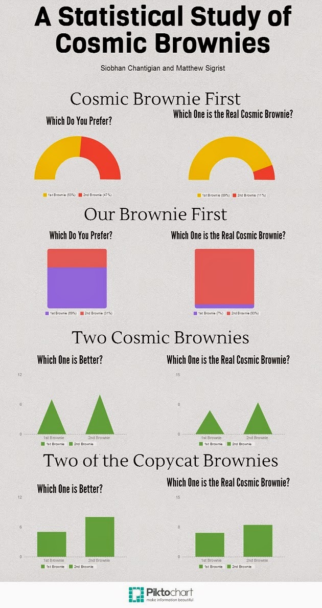
For our project, we asked as many seniors as we could to eat two brownies in a convenience sample that nevertheless managed to reach a significant fraction of the senior class. The experiment participants were able to volunteer to eat the brownies. Siobhan and I baked a batch of copycat Cosmic Brownies, and bought a box of manufactured brand name Cosmic Brownies. We assigned every volunteer to a random number, and this number determined in which order they would eat two brownies. There were 4 numbers, 1-4, with:
1 = Cosmic Brownie first, then one of our copycats.
2 = Our copycat first, then one Cosmic Brownie.
3 = Two Cosmic Brownies.
4 = Two copycat brownies.
After the subject had eaten both of the brownies, we asked them "which brownie, the first or second, that [they] prefer", as well as "which brownie [they] believe to be the store bought brownie," regardless of whether they had actually eaten a store bought brownie or not.
Due to the not-so-subtle difference in the bittersweet frosting on top of our scratch brownies, the difference between the two was recognizable, and this is reflected in the data.
.jpg)
A Statistical Study of Cosmic Brownies
.jpg)
We had this idea while we were looking at pinterest. There are many copycat recipes out there and we chose this because it was going to include cooking and I rather like brownies.
We chose seniors to be our population. We used volunteers and randomized the groups.
We had four different tests. We did the first two tests varying the order and the last two with identical brownies.
We originally predicted that people would like the cosmic brownies more than the copycat brownies. That was until we tried the difference. You can easily tell which one was store bought. I used to think that Cosmic Brownies were amazing until I did this project.
Clearly, as our graphs show, other people could also tell which brownies were store bought.
It was really interesting to see how their preference of brownie was impacted by which one they ate first.
Just note that due to our small sample size our data was not statistically significant.
By: Siobhan Chantigian
Pizza Survey!
My favorite project this quarter was the pizza survey I did with Molly and Alex. We bought two types of frozen pizza, one cheap, one expensive, both thin crust. We then had students eat one slice of each and record which pizza they thought was the most expensive.
Looking back, we introduced some bias by asking which one people thought was the most expensive. We should have just asked which one was better, thus not telling people there was actually a difference.
We also weren't able to keep track of all the students eating pizza, and some people got multiple pieces. Although this didn't really effect our data, it was still annoying.
After analyzing our data, we are 99% confident that 77% to 100% of students can determine which pizza is the most expensive. Going into this project, we weren't sure if we could really prove anything, but looking back, this confidence interval clearly proves that the expensive pizza we used was better than the cheaper pizza.
To make a general prediction about cheap and expensive pizza, we would need to test more types of pizza, in order to find if our data was a one time occurrence or a general rule for all frozen pizza.
 By Luke French
Looking back, we introduced some bias by asking which one people thought was the most expensive. We should have just asked which one was better, thus not telling people there was actually a difference.
We also weren't able to keep track of all the students eating pizza, and some people got multiple pieces. Although this didn't really effect our data, it was still annoying.
After analyzing our data, we are 99% confident that 77% to 100% of students can determine which pizza is the most expensive. Going into this project, we weren't sure if we could really prove anything, but looking back, this confidence interval clearly proves that the expensive pizza we used was better than the cheaper pizza.
To make a general prediction about cheap and expensive pizza, we would need to test more types of pizza, in order to find if our data was a one time occurrence or a general rule for all frozen pizza.
Class of 2014 College Map (:

Would You Rather...?

This project was focused on the difference between those who have but started their high school journey and those who are about to leave for college. It also looked at the difference between the sexes. My group and I commenced our project by finding both "Would You Rather" questions online as well as creating our own. We then used a stratified random sample to choose those that we would survey. We distributed our survey, then analyzed our responses, which can be found to the right. This was by far the best project that I participated in. It was well thought out, and we experienced little to no problems throughout the entire process. Perhaps the most interesting thing that we found was that nearly 20 percent of students would rather give up their friends than their computers. However, there is a grey area around some of our questions where our confidence interval was extremely wide. Besides that, the rest of the data came out how I thought it would. This was my favourite project, and for someone who is very lazy I was abnormally on task, and we finished this project quickly. My favourite statistic that we found was that seniors are nearly even on their preference of movies v. books while the freshmen are much more biased towards movies. I don't know exactly what that means since that would require assuming, and you know what they say about assuming...
Hours of Sleep
This quarter I worked on my survey about hours of sleep Byron High School students get on average and other factors that affect it. I came up with five questions that I wanted to ask on the survey. My group that I was in for my game project and I put all of our questions together into one survey. It was more convenient and time efficient to do one big survey than doing our own surveys individually. My group and I used a random generator found online to randomly select 25 juniors and 25 seniors at Byron High School.
After graphing my data I found some of the results surprising. One was that there was no correlation between hours of sleep and hours of physical activity done in day. I wrote quotes for the graphs that had no correlation explaining why this could be possible. Another was there was there was no correlation between hours of sleep and GPA. There was also no correlation between hours of sleep and the number of meals consumed in a day. The only graph that showed some correlation was between hours of sleep and the number of caffeinated drinks you consumed in a day. The more caffeinated drinks you consumed you'll get less sleep. I thought there would be more correlation in my graphs but there wasn't. My results were not what I expected. I thought the more physical activity you get the more sleep you get cause you would be tired. I thought that there would be some type of link between GPA and hours of sleep. And I also thought that the more meals consumed the more sleep you would get because you would be full and tired.


College Survey

For this project we took a survey of all of the seniors in the 2014 graduating class. In this survey we asked them if they planned on going to college and where they planned on going. From this we were able to get a visual image of just how far the senior class was spreading out in the upcoming years. We were also able see how many people were going to community and technical colleges vs. the number of students going to 4-year colleges. I thought it was interesting to see people going as far as Wyoming and Virginia.
Another thing that was cool to look at was the acceptance rates at the different colleges students planned on going to. We found that one of the colleges, the one in Virginia, had a 33% acceptance rate. Lastly, it was interesting to see where students seemed to cluster. There were quite a few going to RCTC and also high numbers going to Winona. Overall, I think it would be really interesting to keep doing this survey every year for each senior class and then compare them to previous years.
Would you Rather...?

For this project we took a survey of both freshmen and seniors at Byron High School. We randomly choose twenty freshmen and twenty seniors from the whole class list. We decided to ask them simple questions and only give them two options but we were able to easily analyze and compare the data. We asked them questions about life love and scattered topics, but the results were actually really interesting. We asked them a total of twenty questions but choose to only create graphs for the questions that had data that was worth analyzing. After we collected our data we started to look at all of the results to see what we found interesting. We then created a nice visual with Piktochart, and we made colorful graphs for the reader to easily tell what we found in our survey. We also found confidence intervals for each question/ graph. The data that we collected could have been expanded on by others and see if they find other data interesting. If I were to do this project again I would have made sure that our sample was a stratified random sample, so the amount of people we surveyed from each grade were proportional to the size of the grade. I think it also would have been a good idea to stratify our sample to gender too so they can actually be proportional to the number of each gender in our whole population. I would have also have asked them fewer questions because it took quite a long time getting everyone to take our survey.
By: Molly Petersen
Subscribe to:
Posts (Atom)